I don't usually do portrait-style photo shoots -- usually I wait for people to get out of my shots. So, when Annye emailed and asked me to do some promo shots for her up and coming short movie I was a bit unsure of my abilities. I said yes because Annye has a good sense of humour and I had taken a number of head and shoulder shots of her in the past.
We discussed what Annye wanted out of the shoot, what she would wear, and a few shot ideas before the shoot. Then, using the late afternoon light, we met at the Governor General's gardens in Victoria BC on Thur, 5th Mar. When I saw what Annye was wearing -- spaghetti strap bustier and a skirt -- I thought this would be the shortest shoot in history. 10 minutes outside and she would be freezing. But, on the south side of gardens the sun was warm and there was no wind -- we shot for 2 1/2 hours and no one got cold!
The reason I don't like to shoot portraits is because I have a great deal of difficulty visualizing the finished image when I look at a model. I find it much easier to visualize landscapes and macro nature shots. Probably because these things tend to stay still and I can contemplate them. But, the real reason for my reluctance is this: only I will be disappointed if a landscape shot doesn't turn out the way I planned.
Annye was easy to work with and we had some lovely light to play with. I used my flash for most shots and soon realized that for even better light control I'm going to have to get the flash off the camera and control it remotely.
Shooting good portraits is both and art and a science, and requires a lot of practice. Working with outdoor light on the face and body can be so ephemeral -- one moment the light is perfect, and the shot is magic if you and the camera can respond. The next it is gone for ever.
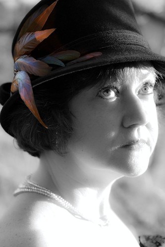
I like this image best out of the ones I did on Thursday. The hat and face seemed to call for a black and white treatment. I did this in post processing (Adobe Light Room) by reducing the saturation on all colour channels. Then I brought back the colour on the feathers using the Light Room's brush tool. I over-saturated these colours so they would pop, but not so much that you missed the searching look in the eyes. This was one of the few shots that I visualized while out on the shoot -- even to the crop of the hat.
I was not too pleased with the over exposure on the upper chest when I saw it, but I liked the light on the eyes, and, when I saw the image on the computer I realized at once that a b&w would work well with the 1940's feel of this shot. I felt the overexposed skin would be a kind of counter-point to the colour in the feathers. However, it might be better if I cropped off the bottom inch -- I'll have to try it.
I'll be doing a bit more work with Annye in the future, but under studio lighting conditions. I'll also be shooting promo shots on the set of her upcoming movie. I'm excited to be doing that type of work, but nervous as well. I certainly have lots to think about. And, lots of practicing to do!
More shots from the shoot with Annye at my Flickr site .
Calypso orchids - just starting out
-
M.E. Sanseverino posted a photo:
[image: Calypso orchids - just starting out]
The leaves of the Calypso orchid come out very early. The buds won't appear...
16 hours ago


0 comments:
Post a Comment